
Principal Financial Group
Simplifying a complex advisor platform.
An enterprise financial-advisor experience with approximately 3,000 pages, years of technical debt, and very limited existing understanding of its actual users.
- Role
- UX Lead
- Scope
- UX Research, Interaction Design, UI Design
- Product
- Financial Advisor Platform
- Timeline
- Approximately 8 months
- Scale
- Approximately 3,000-page existing experience
The problem
Years of complexity had accumulated around the people trying to do the work.
The existing technology license was approaching expiration, and the experience had collected years of technical debt along the way. Organizational silos had each added their own content and entry points, and the result was a bloated site of roughly 3,000 pages.
Very little was known about the advisors themselves. I was the first UX person on the project to speak directly with the people using the platform every day.
What I uncovered
Before simplifying the product, I needed to understand how advisors actually used it.
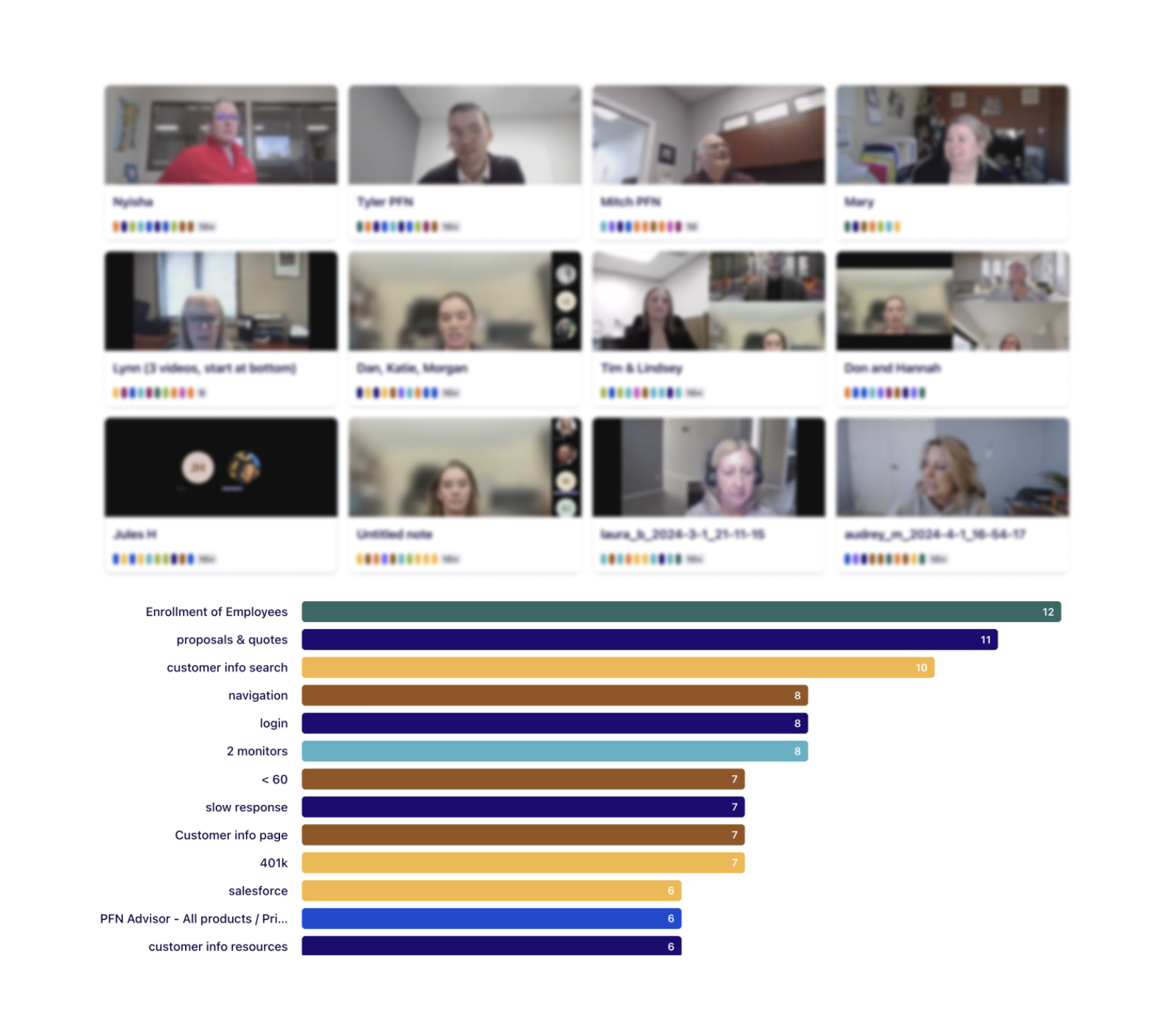
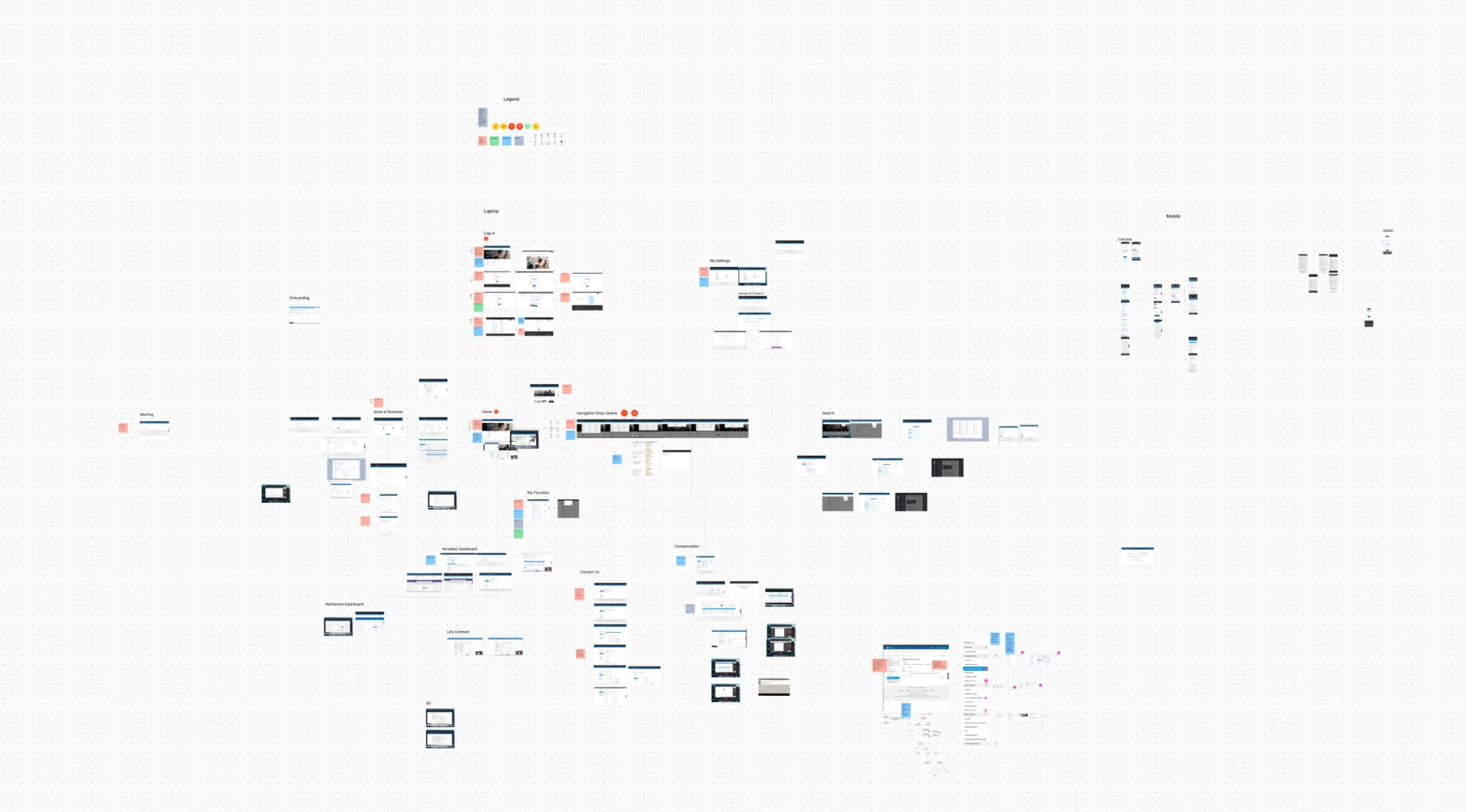
I started by mapping and evaluating the existing experience. A heuristic evaluation captured screens, usability issues, recurring patterns, and severity across the platform. I combined that with interviews, contextual observation, and task-based testing to see where expert evaluation and actual user behavior aligned.
The pattern was clear: advisors needed less complexity, flatter navigation, better search, and important information closer to where they worked.
- Simplify: reduce what advisors have to move through.
- Make features and content earn their place.
- Flatten navigation instead of adding more of it.
- Bring important information closer to the homepage.
- Make primary search significantly more useful.
From evidence to direction
The answer wasn't more navigation. It was less distance between advisors and what they needed.
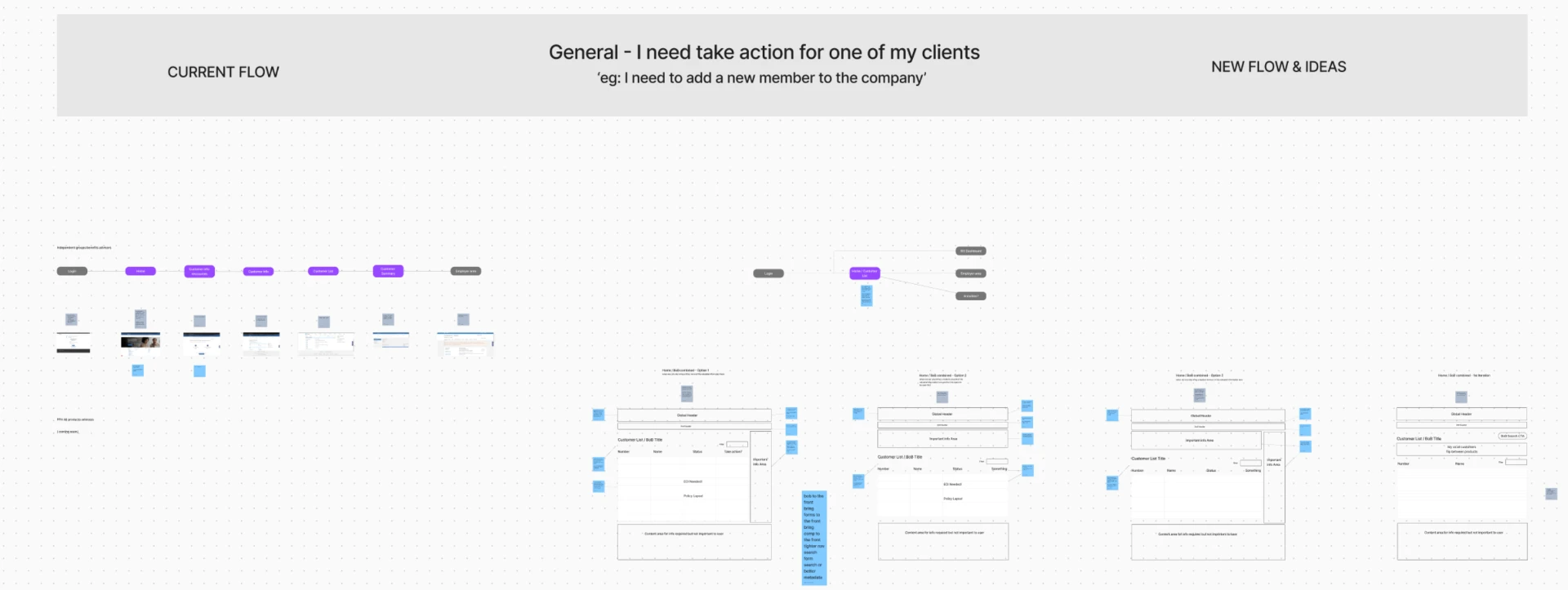
Each finding translated into a decision about structure: flatten navigation, remove unnecessary complexity, surface frequently needed information earlier, improve primary search, and take unnecessary steps out of important workflows.
What changed
Critical information moved closer to the work.
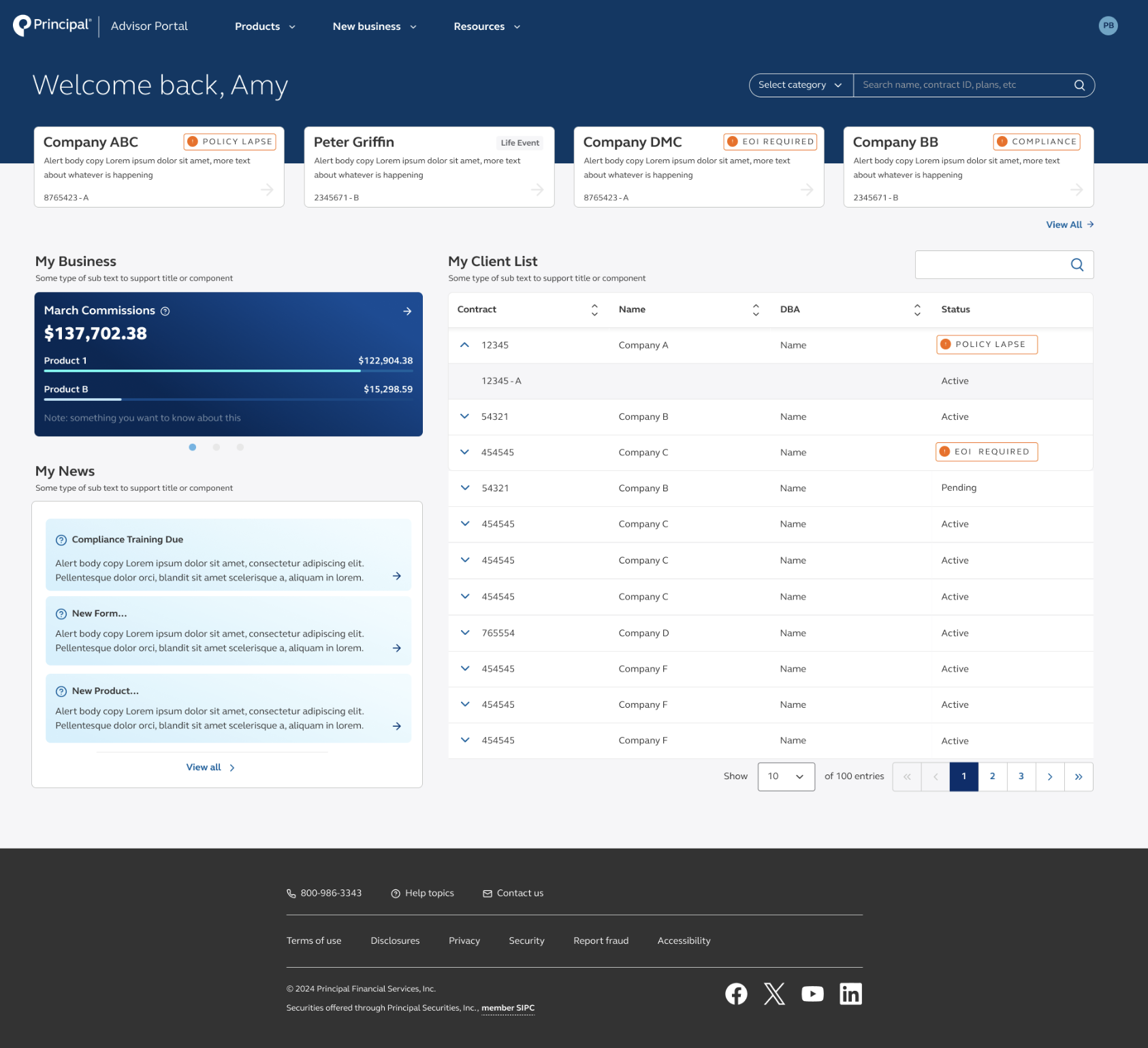
Instead of requiring advisors to hunt through the experience, the redesigned homepage brings frequently needed information forward: commissions, client information, important alerts, and the other things advisors reach for every day.
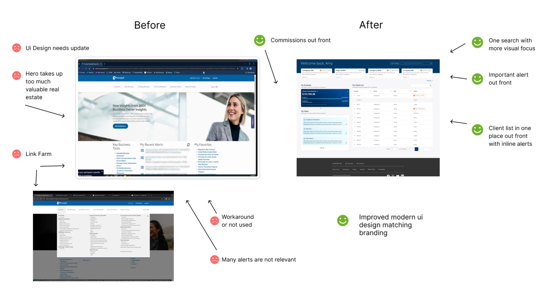
- Commissions moved out front rather than being buried.
- The client list sits on the homepage, with status and alerts inline.
- One search, with more visual focus, replaced competing entry points.
- Modern UI aligned to the brand, replacing the outdated interface.
5 unnecessary steps removed
A primary advisor workflow was simplified by removing five unnecessary steps.
- Important information was brought closer to the homepage.
- Navigation was simplified.
- Research created direct understanding of advisor needs.
- Product decisions were grounded in observed user behavior.
What this work demonstrates
Making complexity useful.
This work required more than redesigning screens. It meant understanding how years of organizational and product complexity affected everyday work, then using evidence to decide what deserved to remain, what needed to move, and what could disappear.
Work with me
Have a product problem you're trying to figure out?
Tell me what's happening. We can figure out whether Express UX can help.